How to integrate Pantone 2021 colors into your decor
14 Feb 2022
The tradition continues again. Pantone surprises us by choosing a duo for 2021. Neutral gray (17-5104 Ultimate Gray) and bright yellow (13-0647 Illuminating) will be in the spotlight this year. Find out how to incorporate them into your decor.
What’s the Pantone color of the year?
Founded in 1963, the Pantone principle was created to solve the more complex color analogy problem in printing. Soon after, the Pantone Matching System (PMS) became the easiest way to list colors using their catalog and classification method. For more than 55 years now, Pantone has been the world's most important color matching system.
Every December since 2000, the Pantone Color Institute has unveiled the color of the coming year. The selection process for this innovative concept is the result of the influence and analysis of several important contemporary sociological sources and factors.
It's no surprise that the Pantone Color of the Year is eagerly awaited with so much excitement and anticipation for all creative spheres as a whole.
Why neutral gray and bright yellow?
The Pantone Colors of the Year reflect the color trends in fashion, beauty, design, and home decor for the coming months. Regarding 2021, Pantone wanted to convey a message of joy and serenity due to the past year which has been more than trying worldwide.
The shade of gray is meant to soothe, reassure and wrap ourselves in a true haven of peace, while the bright yellow hue is meant to instill hope and spread benevolence in order to stimulate meaningful vitality.
How to incorporate yellow and gray into your interior design
Even if you think yellow is a lovely color, you might not know how to match it in your home. Many people do not use this shade to decorate an entire room, but rather use it as a color accent sparingly.
A touch of yellow can liven up a space and bring some style to the more subtle gray. Yellow can bring warmth and character with a simple touch of paint or in accessories dotted around the room. Here are some pretty spaces that show how these two colors can work together in the most wonderful way.
The Livingroom
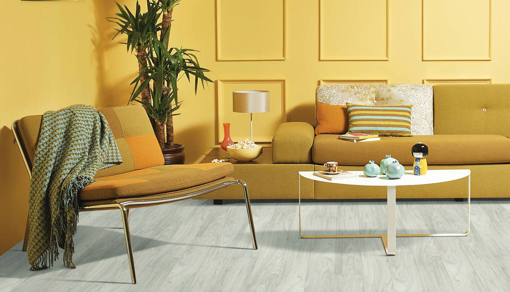
Armada II Laminate Floor - Urbania Collection
Create a refreshing atmosphere by marrying the bright yellow of your walls with neutral gray flooring such as our Armada II laminate floor, reminiscent the hardwood effect. The result is a glam and sophisticated room.
The Windows
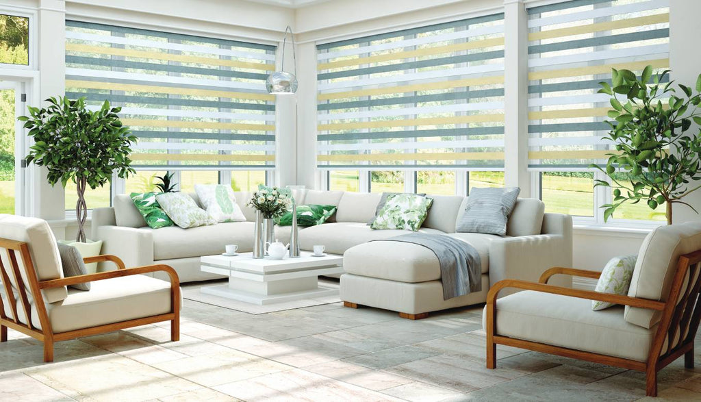
Alternating Vision Screens - Carsan Collection
A combination of gray and yellow works well with a modern, contemporary style. Here, the alternating Vision screens add a bold contrast to the elegance of this living room.
The Nursery
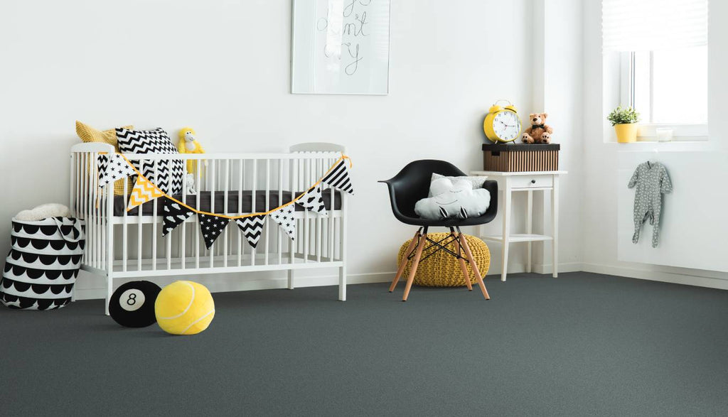
Boa Rolled Carpet - Nobilia Collection
Gray is a restful shade and can aid your child sleep, while pops of yellow make the space a bit more appealing. If you are planning on keeping the surprise but want to prepare your nursery ahead of time, our gray Boa rolled carpet and yellow accessories are great gender-neutral and fashionable choices.
The Hallway
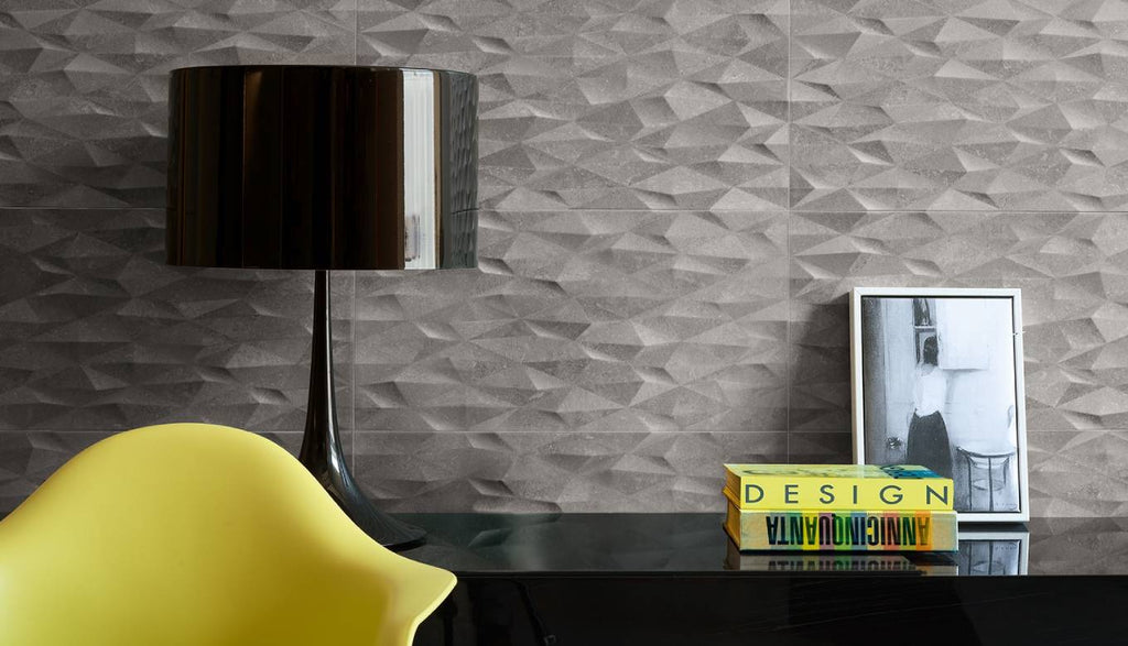
Wall Covering - Inspiration Design Collection
If your primary color is gray and you do not want to make a long-term commitment to a bright yellow color, choose a few small accessories across your room, like this chair or those books. The pops of yellow are eye-catching and add balance to the decor of this hallway featuring dramatic 3D wallcovering.
Feel inspired ?
Find all the above products on our website to order online or meet our Flordeco experts at one of our stores. They will be able to give you advise on how to choose the ideal material for a fantastic and trendy result!
